Corundum Typeface Spread and Animation
Exploring the unique history and characteristics of a revival typeface.
[Print design, Motion graphics]

Released in 2006 by Joshua Darden, Corundum is a typeface that draws inspiration from the 18th-century book Manuel Typographique, resulting in classic, elegant type with a modern touch. I aimed to inform audiences about Corundum, from the history of its conception to the features that make the typeface unique. A goal was get people, including non-designers, interested in typography through appealing and educational visuals.
In this two-page spread, I wanted to mirror the typeface Corundum’s visual style, which balances the classic with the modern. Details like the larger first letter “I” (the drop cap) and the footnotes call back to older books. On the other hand, the large, broken up “Corundum” title and the overlaying of blue circles over letters to call attention to specific features are more contemporary choices that contrast the classic ones.
[more on my Process]

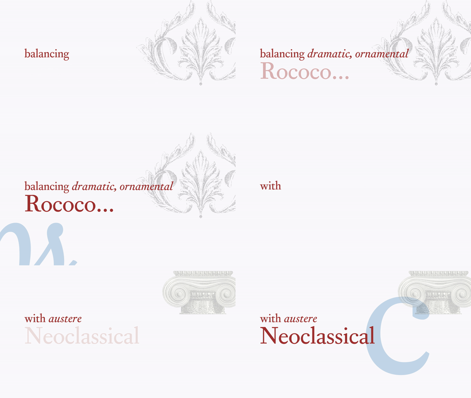
The medium of animation allows this video to expand on ideas presented in the booklet. The use of motion helps to show more subtle characteristics and features like the different thicknesses Corundum offers and pictographs included in the typeface. I placed emphasis on matching the movement of my animation with the beats of the background music. I wanted these movements to feel smooth and snappy, so I tweaked the easing to exactly how I wanted.
[more on my Process].gif)
.gif)
.gif)
.gif)
